Swarovski — Mobile Shopping Experience UX Audit
An independent usability and information-architecture audit of the Swarovski mobile shopping experience, examining navigation, product discoverability, and checkout flow through a QA and product-quality lens.
Overview
Swarovski's mobile site is a high-traffic, high-value shopping surface — every point of friction in navigation or checkout has a direct, measurable cost. This audit applies the same systematic, edge-case-aware thinking I use in QA to a live consumer product, evaluating the experience against established usability heuristics and real user flows rather than surface-level aesthetics.
The Problem
The goal was to identify where the mobile experience creates unnecessary friction for a first-time shopper — before those issues surface as support tickets, abandoned carts, or negative reviews. The audit focused on three journeys: product discovery, product detail comprehension, and checkout.
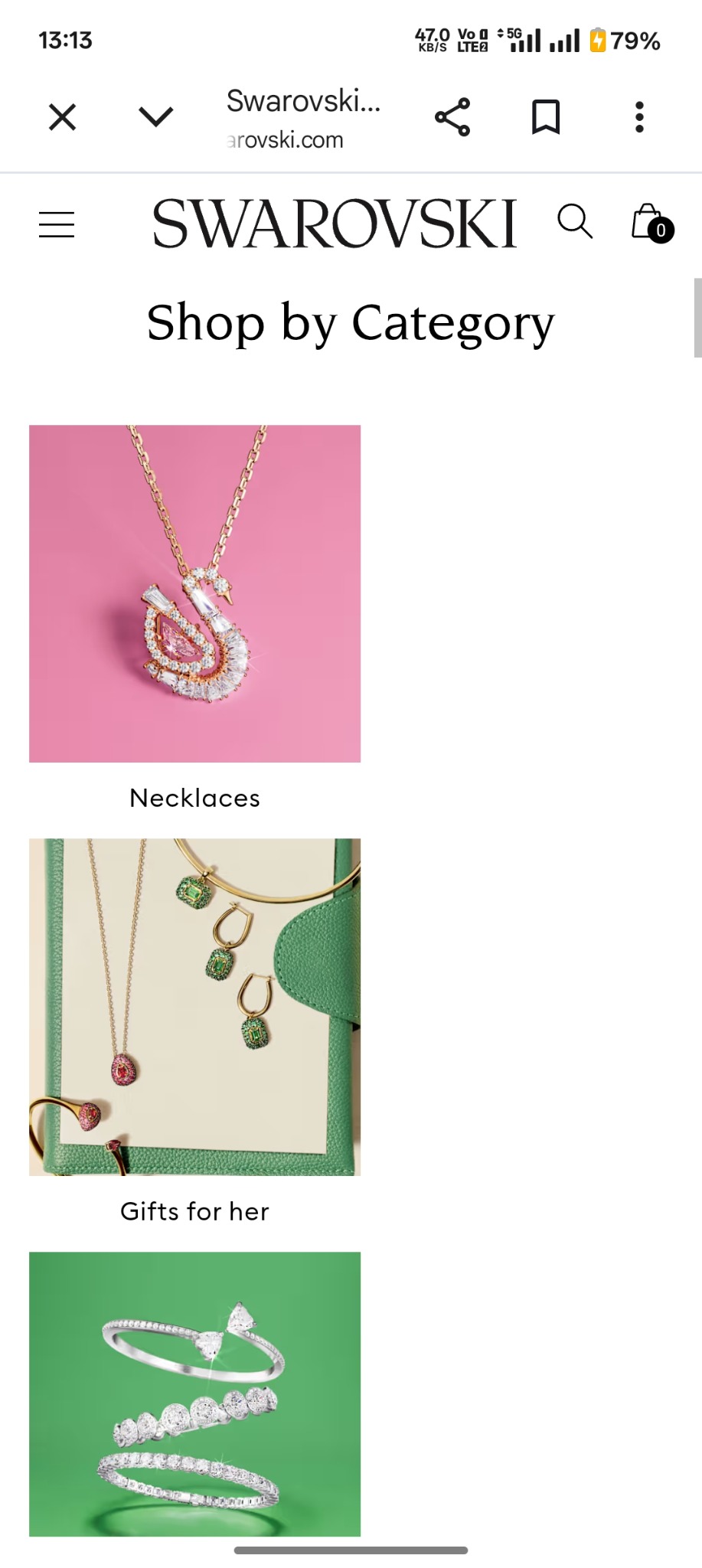
- How easily can a new visitor find a specific product category from the homepage?
- Does the product detail page give enough information to purchase with confidence?
- Where in the checkout flow does friction or ambiguity appear?
Approach
I walked each journey on a real device, documenting every point of hesitation, ambiguity, or inconsistency — the same way I'd document a defect during exploratory testing. Each finding was logged with its location, the expected vs. actual behaviour, and a severity rating, then cross-checked against Nielsen's usability heuristics and standard e-commerce UX conventions.
Key Findings
- Category navigation relies on a deep menu hierarchy, requiring more taps than comparable mobile-first retailers to reach a specific product type.
- Some product detail pages lack clear sizing/fit guidance, increasing the likelihood of return-driven abandonment.
- Checkout does not consistently surface inline validation, so errors are discovered only after form submission.
- Filter and sort controls behave inconsistently between category and search-result views, breaking the user's mental model.
Recommendations & Impact
Recommendations were prioritised the way I'd triage defects — by user impact and implementation effort — rather than by novelty. Flattening the category hierarchy and adding inline checkout validation were flagged as the highest-impact, lowest-effort fixes, with clear potential to reduce abandonment at exactly the points where users were observed to hesitate or backtrack.
Reflection
This audit is part of an ongoing effort to apply QA-grade rigor to product and UX problems — treating usability issues with the same structured evidence, severity triage, and clear reproduction steps I'd use for a functional defect. It's the kind of system-level thinking I bring to every QA engagement, whether the "bug" is in the code or in the flow.