Late Validation in a Food Delivery Cart Flow
A QA-led UX observation on preventing invalid states — examining what happens when a cart constraint is communicated only at checkout.
01 — The Observation
While placing an order on a food delivery app, I noticed that the app allowed me to continue adding items to the cart without any visible indication that I had reached or was approaching a cart capacity limit.
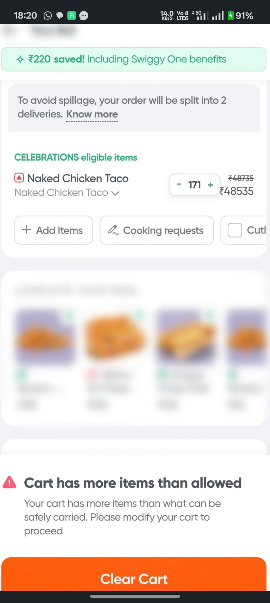
Only at checkout did the app display: “Cart has more items than allowed.” It also explained that the cart contained more items than could be safely carried and asked the user to modify the cart.
This raised a QA and product question: Should users be allowed to enter an invalid state if the system already knows that the state cannot be fulfilled?
02 — The User Journey
Browse food → Add item → Add more items → Continue adding → Open cart → Proceed to checkout → Limit exceeded → Modify cart
The issue is not necessarily that validation exists. The interesting part is when the user discovers it.
03 — The UX Friction
From the user's perspective, the previous actions appeared valid. There was no obvious indication that a maximum cart capacity existed, that the user was approaching the limit, or that adding another item could eventually prevent checkout.
The user can therefore spend time building an order only to discover the restriction at the end of the journey. This creates a potential late-validation problem.
04 — Why This Matters
Late validation can introduce unnecessary friction because the user has already invested effort in completing the task. They must understand why checkout failed, determine what needs to change, modify the cart, re-evaluate the order, and attempt checkout again.
From a QA perspective, the functionality may technically be working as designed. From a UX perspective, the question becomes: Could the system communicate this constraint earlier?
05 — Important Product Context
There may be a legitimate operational reason for the limitation, such as delivery capacity, rider carrying limits, packaging constraints, order size, restaurant or fulfilment rules, or logistics calculations.
Because those business rules were not independently verified, I would not classify the behaviour as an outright defect. I would frame it as a UX / validation opportunity: the business rule may be correct; the timing and communication of that rule are what deserve consideration.
06 — Potential Improvements
Option 1 — Prevent the invalid state
Once the maximum is reached, prevent additional items from being added and provide immediate feedback explaining the constraint.
Option 2 — Warn before reaching the limit
Show a contextual warning such as “You're approaching the order limit” so the user can adjust before reaching the constraint.
Option 3 — Make the constraint visible in the cart
A simple indicator such as 18 / 20 items can make the current state predictable.
Option 4 — Explain the recovery path
If supported by the business model, offer an alternative such as splitting the order into multiple deliveries.
07 — QA Perspective
This observation highlights the distinction between functional correctness and experience quality. A functional test might ask whether checkout is blocked when the cart exceeds the limit. A broader QA question asks whether the application communicates the constraint at the point where it becomes relevant.
Functional
- What happens when the maximum item count is reached?
- Can the user add another item?
- Can the user proceed to checkout?
- Is the correct validation displayed?
Boundary testing
- Maximum allowed items
- Maximum + 1
- Removing one item after exceeding the limit
- Adding and removing items repeatedly
UX testing
- Is the limitation communicated before checkout?
- Does the user understand why checkout is blocked?
- Can the user easily identify what needs to change?
Recovery testing
- Can the user recover without losing the entire cart?
- Is there a clear path back to a valid state?
- Does the system preserve the user's selections?
08 — Proposed Improved Journey
Current: Add → Add → Add → Checkout → ❌ Limit exceeded
Proposed: Add → Warning → Limit → Guidance → Valid checkout
The goal is not simply to validate earlier. The goal is to make the constraint predictable, understandable and recoverable.
09 — Key Takeaway
This small interaction highlighted something I find increasingly important about QA: a system can be functionally correct and still create unnecessary user friction.
Testing should not always stop at “Did the application reject the invalid action?” Sometimes the better question is “Could the application have helped the user avoid getting there in the first place?”
That's where QA, UX and product thinking start to overlap.
Case Study Classification
- Type: UX / Usability Analysis
- Domain: Food Delivery
- Area: Cart & Checkout
- Primary Theme: Late Validation
- Secondary Themes: Error Prevention · Boundary Conditions · User Recovery · Constraint Communication
Note: This is an independent observation based on the observed app behaviour. The business rule and operational constraints behind the cart limit were not independently verified.